Cloud Cover, Clean Colour: Turning Dull British Days into Luminous Paint
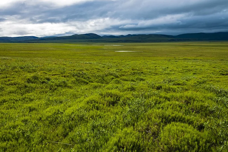
Photo: Daniel Case, CC BY-SA 3.0, via Wikimedia Commons
Grey is not the enemy of a British landscape painter. Mud is. And the two get confused all the time.
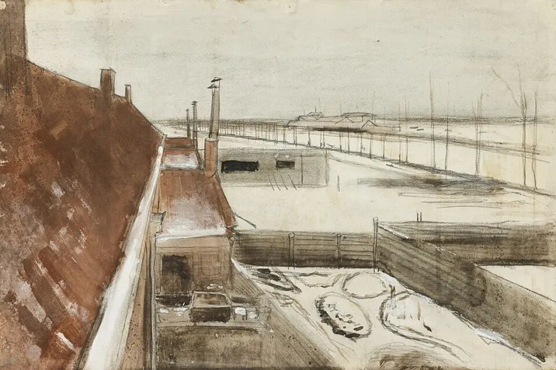
This November, with the light thinning by mid-afternoon and the sky sitting low over the rooftops, I have been leaning into the kind of weather that many painters treat as a reason to stay indoors. The result has been a small run of works in progress that feel more luminous than the ones I made in brighter weeks. Not because the weather is secretly cheerful, but because flat light asks different questions of a painting.
Why grey gets a bad press
A blue-sky day gives you drama for free: hard shadows, strong colour separations, a ready-made focal point. An overcast day gives you none of that. What it gives you instead is nuance. The sky becomes a giant diffuser, wrapping the landscape in soft, even light. Colours stay closer in value, which means you have to work harder to create depth — but when you do, the result can feel intimate rather than theatrical.
The trick is not to paint the grey itself. Paint the colour that survives inside it. A wet Norfolk field under cloud is rarely just green. It is olive, rust, slate, a thin wash of ochre, and a hundred subtle shifts between. If you mix one average green and cover the area, you get mud. If you look for the temperature changes — cool shadows, warm dead grass, a violet edge where the hedge meets the sky — you get air.
The palette I keep reaching for
I have a simple rule for dull-weather painting: no black, no pre-mixed greys, and no fighting the light. My studio palette this month has been raw umber, yellow ochre, transparent red oxide, ultramarine, cobalt blue, a little Naples yellow, and titanium white. That is enough to make warm and cool neutrals without reaching for a tube labelled 'grey'.
For sky passages, I tend to build a cool base — ultramarine with a touch of umber and white — then scumble warmer, thinner layers over the top. The aim is not a flat cloud sheet. It is a sky that has weight and movement. A little titanium white dragged lightly across a half-dry grey can suggest cloud break without turning chalky. Keep the paint thinner in the distance and thicker in the foreground, and even a low-contrast scene will start to pull you in.
Mud usually comes from overworking. If you find yourself pushing a mix around the canvas for too long, stop. Scrape it back if needed. Let a passage dry and glaze over it. In overcast light, clean edges and distinct temperature shifts matter more than dramatic value jumps.
Photographing reference when the sky is flat
I photograph a lot on dull days, partly because I like walking in weather that keeps everyone else indoors. The camera does not always agree. Auto white balance can turn a soft grey afternoon into a sickly yellow-green, and a phone’s HDR setting can flatten the very subtleties you are trying to record.
My approach is basic: shoot in RAW if you can, switch off automatic HDR, and include a grey card or a piece of neutral card in the first frame. That gives you something to balance against later. Take wide shots for composition and close details for colour notes — lichen on a gate, the bruised purple of a cloud edge, the way wet tarmac reflects a hedge. On a flat day, those details are often where the painting actually lives.
Do not worry about making the photograph beautiful. It is a notebook, not a finished work. If the image looks dull on screen, that is fine. You are collecting information, not advertising a holiday.
A studio note from this week’s works in progress
One of the paintings on my easel is a small panel of a fenland track after rain. In the reference photograph, the sky is almost featureless. In the painting, I have kept the sky quiet and put the colour into the wet ruts and the bleached grasses at the verge. The lightest light is not the sky; it is a thin band of water catching the cloud. The darkest dark is not a tree; it is a shadow under the hedge. That inversion of expectations is what makes a grey day interesting.
Try it: the three-value thumbnail exercise
In your sketchbook, draw a simple box roughly the shape of your canvas. Choose a dull-weather scene — a field, a street, a window view — and mix only three values: a light grey, a middle grey, and a dark grey. Use them to block in the big shapes. No detail. No colour. Then ask yourself: where is the lightest light, and where is the darkest dark? If the answer is obvious, you have a composition. If it is not, simplify until it is.
Do three of these in one sitting. The first will feel awkward. The second will teach you something. The third will probably be the one you want to paint. Overcast light rewards patience and subtraction. It is not a lesser version of a sunny day. It is a different kind of looking — and for British landscape painters, that is an advantage worth keeping.